Ministry of Propaganda - 11/Jan/2004: "My handwriting as a font"
[Previous entry: "Naked propaganda"] [Home] [Next entry: "Payback time ;-)"]
My handwriting as a font
When I first saw the link (I think at vowe dot net) I was sceptical, but when I tried it it really worked: At Fontifier you can create a font of your own handwriting. You download a template from the website, print it off and then fill it in with the individual characters. Once complete you scan it in, upload it on to the website and it returns the font for you to download.
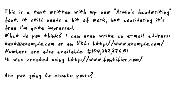
The process is fairly straightforward, although I needed several attempts to upload my filled in template. The scan needs to be of a very good quality and should be cleaned up as much as possible before trying to upload it. Otherwise it is likely to be rejected. The result is far from perfect, I had two problems with my font: The spacing of the individual letters is sometimes a bit odd. It doesn't create a good proportional font, it's sometimes almost like a monospace font (i and m getting the same space, which looks strange). Due to the way the template works the alignment to the baseline is quite difficult, so the individual letters move up and down a bit. This can be fixed fairly easily though, I've used High Logic's Font Creator Program to fix the biggest issues.
Here's how my font currently looks:

Still some work to do, but not too bad for two hours (or so) of work.
End of entry
Entry trivia
- When writing this entry the weather was: Heavy rain
- When writing this entry I was listening to: The rain on my window
- I recently visited this website/-page: The Cartoonist
- The last drink I had was/is: Tea (Earl Grey)
End of entry trivia
Send me feedback about this entry:
The form below will send me an e-mail. To discuss in public, please use my discussion forum.
